THE POSSIBLE DREAM comes true with supermarket architectural services
by Ronald Tanner
Combining unusual remodeling ideas with unorthodox merchandising tactics and supermarket architectural services by CONCEPTS-ENTERPRISE helped make the store Bill Wooley dreamed of running a smash success.
Thirty years ago, Bill Woolley had a dream that someday "I'll run the nicest store on Long Island." Today he feels he has fulfilled that dream with the Foodtown he owns in Northport, N.Y.
Woolley's dream has come true through the expansion and remodeling of a 12,000 square foot supermarket he has operated since 1972.
DESIGNING A MODEL SUPERMARKET
Northport, an affluent community on Long Island's north shore, sports a demographic cluster of consumers that can easily support a top-of-the-line supermarket. And since the commercial development of Northport is tightly controlled, it was high unlikely that new competition would be able to enter the market.
"The store had an excellent track record and a low mortgage rate, plus a good location that could be reached by a lot of people," Woolley says.
To help transform his concepts into reality, Woolley hired Richard Paroly of CONCEPTS-ENTERPRISE, a Port Washington, NY based architectural firm.
"Architects have traditionally not taken supermarkets seriously," says Paroly, 33, who received an early appreciation of supermarkets because his father, Bernard Paroly, is President of Pathmark. "Yet supermarkets offer an outstanding challenge. In addition to the building design we included store planning , interior design and merchandising in our thinking."
Working within the parameters dictated by the shell of the old store and the piece of land upon which they were expanding, Woolley and Paroly started last autumn to plan the expansion. The design and merchandising focus of the remodeled store would be on service departments like deli and fish.
Woolley explains, "I wanted to create a shopping experience that was a step above anything that anybody in town had ever experienced. The new store would be the supermarket of the future, a place that people in 1990 could look at and say, 'That Foodtown showed the grocery industry how food stores should be.' "

CONCEPTS-ENTERPRISE provided a major factor of the success of this project with its unique combination of Architectural, Store Planning, Interior Design, and Construction Management services. We were able to develop a dynamic design for the customer's experience from the exterior, to the entry, through the entire store and on the way out.

Woolley and Paroly positioned the service departments in the new section of the store and gave each a distinct identity through varying ceiling heights, decor treatment, signage, and merchandising. Everything was devised, planned and implemented within nine months.
Planning and perfecting was continuous throughout the construction of the new part and the facelifting of the old section. As a department started to take shape, Woolley would often have an idea for improvement. The drawings were adapted and the new idea implemented. The store remained opened throughout the remodeling.

DESIGN GOALS
"My goal was to design a supermarket that reflected the dynamic and intriguing qualities of the service departments,'' Paroly says. "Mr. Woolley has some strong ideas about merchandising perishables, such as his insistence on selling fish and seafood on ice.
''The role of the architect is to integrate and synthesize a retailer's ideas into a coherent interior design. That results from a lot of dialogue between the two. When they understand each other, a much better store results."
To highlight the various service departments, Paroly employed varying ceiling heights and lighting techniques. Five different ceiling heights are used throughout the store to create different environments in the various departments.
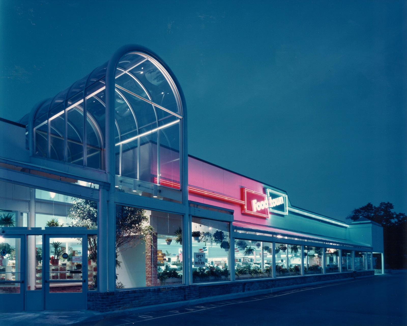
The architectural highlights of the Foodtown include an atrium entrance and a skylight that runs the entire length of the selling area. The skylight effect is carried into some perishables departments such as produce through the use of arched ceilings and indirect lighting. The Foodtown has a bright and clean look with no heavy decor touches...
Since the completion of the remodeling, Woolley has been operating his store in a rather unorthodox manner. To introduce the service departments, he is leading with perishables instead of groceries.
Woolley has switched a lot of customers over to his model supermarket. More than 21,000 Long Islanders visit his store every week...
See how CONCEPTS-ENTERPRISE can help your project be a success.
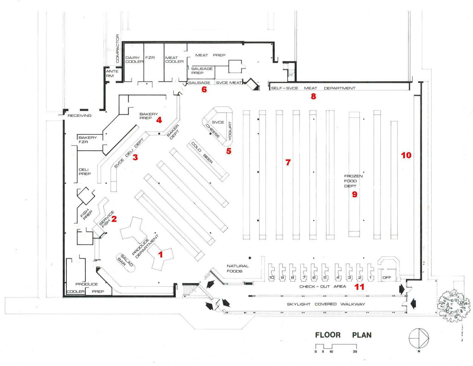
- 1 PRODUCE: Since the remodeling produce sales have skyrocketed...Shoppers are made immediately aware
- 2 SEAFOOD: After leaving produce, customers come directly into the service fish department. In contrast with most service seafood operations, fish and seafood are merchandised on ice and unshielded from customers, like in a wholesale fish market.
- 3 DELI: Kate's Kitchen, the first section of the service deli...also sports and 8 foot section stocked entirely with smoked fish and kosher deli meats...the remaining 20 feet contains non-kosher deli meats and sheese.
- 4 BAKERY: "...appearance of a service department...but actually self service...
- 5 SERVICE ISLAND: Says store designer Paroly "We used the service island as a station to tie together diverse services and products"...combines fancy cheeses, gourmet coffee and a frozen yogurt bar. Coffee, soft drinks and hot dogs are also sold here.
- 6 SERVICE MEAT: Consisting of the Sausage Kitchen and the Butcher Shoppe, service meat encompasses 32 feet of display across the back wall.
- 7 GROCERY: To complement the unusual layout of the service departments, grocery gondolas on the left side are angled. The grocery section is highlighted by a skylight that stretches the length of the aisle that runs between the angled and straight gondolas.
- 8 MEAT: ...60 feet of 3-deck self service meat
- 9 FROZEN FOOD
- 10 DAIRY: ...84 feet
- 11 FRONT END: One of the most impressive design touches in the store is the covered walkway and atrium that extends 15 feet in front of the scanning registers." The open area impresses customers when they come and when they walk out. It sets them in the proper mood to shop and leaves them with a fond remembrance of the store." Paroly says.

